
Back in 2018, we asked people to do a Website Improvement Survey to determine how well the site was working for our users. Technology moves quickly, and while we’ve kept adding content to Findandconnect.gov.au, the infrastructure of the site and the way it works hasn’t been updated in a long time.
We discovered that some things were counter-intuitive, some information was really difficult to find, and gained insight into how people approached finding the information they need. We got feedback from key users of the site, including support services, about how to make things work better for them.
We made what changes we could based on the existing infrastructure, and widened usability testing in 2019 to both people familiar with the site, and to those visiting for the first time. This taught us a lot about how people navigate to information when they’re unfamiliar with the site, giving us a lot to work on in terms of how we present information to make it easier for people to find what they’re looking for.
The huge changes that covid brought in 2020 and 2021 impacted on what we could achieve over that time. We also encountered all sorts of problems in bringing across such a large and complex site onto a new system, much of which didn’t exist when it was first built. While building the new system, we continued adding new information, updates and improvements to the site, which also need to be carried across.
There’s still a way to go, but we’re excited to let you know that we are starting usability testing on the new system with a small group of volunteers. Bringing a site as large and complex as find & connect across to a new system is a huge undertaking, and there are still bugs to iron out, but we have addressed many of the issues you let us know made using the site difficult.
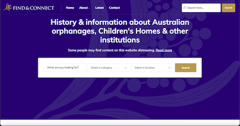
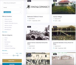
The search function makes it much easier to find what you’re looking for, and you have a lot more control over what is included in your search (you can search everything on the site, or filter down to a much narrower range) .
The map has been integrated, so when you search you can choose whether to have your information presented on the map, or as the usual list.
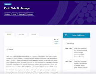
Everything on the database – institutions, their records etc, include links in the body of the text – no more scrolling through long lists at the bottom of the page to find what you’re looking for.
Information about institutions has been reorganised, making it easy to see key information such as dates, locations and name changes.
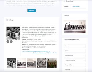
Images have been more fully integrated, and display when you search.
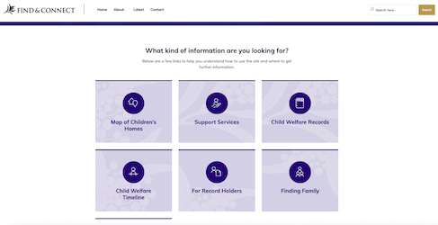
General information on the site has been organised into sections on the home page, and is now searchable.
Information on the site is being cleaned up so it is more accessible, easier to find and clearer than before.
There is a direct email form on all database pages, making it easier than ever to contact us to give feedback, or a support service for assistance.
The new system also allows us to update information much more easily, meaning we can respond to your feedback more quickly than we’ve been previously able.
After our initial testing and improvements, we will extend usability testing to a larger group. As we did last time, we’ll post a link on the blog for you to be involved. If you’d like to participate in usability testing and are worried you might miss the post, let us know (select ‘feedback’) & we’ll make sure to contact you directly when we’re ready.